
How to Design Basic Reports in Power BI Step by Step
Power BI has become one of the world’s most popular Business Intelligence (BI) tools for transforming raw data into meaningful insights. Organizations across industries rely on Power BI to create interactive dashboards and professional reports that help managers make data-driven decisions.
If you’re new to Power BI, designing your first report may seem challenging. The good news is that Power BI provides an intuitive drag-and-drop interface that allows beginners to build attractive reports without extensive programming knowledge.
In this guide, you’ll learn how to design a basic Power BI report from start to finish.
YouTube link :- https://www.youtube.com/watch?v=BSJn9CO7EQE
What is a Power BI Report?
A Power BI report is a collection of interactive visualizations such as:
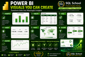
These visuals work together on one or more pages to tell the story hidden inside your data. Reports are interactive, allowing users to filter, drill down, cross-highlight, and explore information dynamically.
Why Learn Power BI Report Design?
A well-designed report helps users:
- Understand business performance quickly
- Identify trends and patterns
- Make better business decisions
- Monitor KPIs
- Compare sales and revenue
- Analyze customer behavior
- Improve productivity
Professional report design is one of the most valuable skills for Data Analysts and Business Intelligence Developers.
Prerequisites
Before creating reports, install:
- Power BI Desktop
- Microsoft Excel (Sample Data)
- Windows Operating System
Basic knowledge of Excel is helpful but not mandatory
Step 1: Open Power BI Desktop
Launch Power BI Desktop.
You will see:
- Home
- Report View
- Data View
- Model View
Report View is where you’ll design your dashboard.
Step 2: Import Your Data
Click:
Home → Get Data
Choose your data source:
Excel
SQL Server
CSV
Azure
SharePoint
Web
Select your dataset and click Load.
Power BI automatically imports the data into the report.
Step 3: Review Your Data
After loading:
- Check column names
- Verify data types
- Remove unnecessary columns
- Rename fields
- Ensure dates and numbers are correct
Clean data leads to better reports.
Step 4: Create Your First Visualization
From the Visualizations pane:
Select a chart such as:
Clustered Column Chart
- Bar Chart
- Pie Chart
- Line Chart
- Table
Drag fields into:
- Axis
- Values
- Legend
Power BI automatically creates the visualization.
Step 5: Add KPI Cards
Cards display important business metrics.
Examples:
- Total Sales
- Total Orders
- Total Customers
- Profit
- Revenue
These KPIs should typically be placed at the top of your report for quick visibility.
Step 6: Create Charts
Common visualizations include:
Column Chart
Compare sales across categories.
Line Chart
Analyze monthly trends.
Pie Chart
Show category-wise percentage distribution.
Donut Chart
Display market share or product share.
Bar Chart
Compare regional performance.
Table
Display detailed transactional data.
Choose visuals based on the business question you want to answer.
Step 7: Add Slicers
Slicers make reports interactive.
Examples:
- Year
- Month
- Region
- Product Category
- Salesperson
Users can instantly filter the report using slicers.
Step 8: Apply Filters
Power BI supports:
Visual Filters
Apply to one visual only.
Page Filters
Apply to the current page.
Report Filters
Apply across the entire report.
Filters help users focus on relevant information.
Step 9: Format Your Report
A professional report should include:
- Consistent colors
- Clear titles
- Readable fonts
- Proper spacing
- Grid alignment
- Company branding
- Icons where appropriate
Keep the design clean and avoid clutter. Microsoft recommends using alignment, gridlines, and visual hierarchy to improve readability.
Step 10: Add Titles
Each visual should have a meaningful title.
Examples:
- Monthly Sales Trend
- Top 10 Products
- Sales by Region
- Revenue Analysis
- Customer Distribution
Titles help users understand the report instantly.
Step 11: Use Themes
Power BI provides built-in themes.
You can also create custom themes using your organization’s brand colors.
A consistent theme gives your reports a professional appearance.
Step 12: Arrange the Layout
A good report layout generally follows this structure:
Top Section
KPI Cards
Middle Section
- Sales Trends
- Revenue Charts
Bottom Section
- Detailed Tables
- Product Analysis
- Customer Analysis
Keep related visuals together to improve readability.
Step 13: Test Interactivity
Click on different visuals.
Notice how Power BI:
- Cross-filters
- Cross-highlights
- Updates other charts automatically
This interactive behavior is one of Power BI’s most powerful features.
Step 14: Save Your Report
Click:
File → Save
Your report will be saved as:
.pbix
This file contains:
- Data
- Visuals
- Model
- Report Design
Step 15: Publish the Report
After completing your report:
Click:
Home → Publish
Choose your Power BI Workspace.
Your report is now available online for sharing and collaboration.
Best Practices for Power BI Report Design
Follow these recommendations:
- Use consistent colors throughout the report.
- Limit the number of visuals on a page.
- Highlight key KPIs at the top.
- Avoid unnecessary decorations.
- Use meaningful chart titles.
- Include slicers for interactivity.
- Choose the right chart for the data.
- Optimize for readability and performance.
- Maintain consistent spacing and alignment.
- Design reports with the end user in mind.
Common Mistakes Beginners Make
Avoid these pitfalls:
- Overcrowding the report with visuals
- Using too many colors
- Ignoring data relationships
- Choosing the wrong chart type
- Not using filters or slicers
- Inconsistent formatting
- Missing titles and labels
- Poor alignment
- Displaying unnecessary information
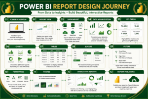
Skills You Will Learn
By following this tutorial, you’ll gain experience with:
Career Opportunities
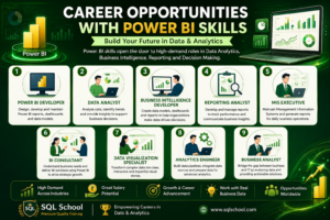
Learning Power BI report design can lead to roles such as:
Why Learn Power BI from SQL School?
At SQL School Training Institute, we focus on practical, job-oriented learning that prepares students for real-world analytics projects.
Our Highlights
- Industry-Experienced Trainers
- Live Interactive Classes
- Real-Time Projects
- Hands-on Dashboard Development
- Power Query & DAX Training
- Interview Preparation
- Resume Building Support
- Microsoft Certification Guidance
- Flexible Online & Offline Learning
- Placement Assistance
Whether you’re a beginner or a working professional, SQL School helps you build the practical skills needed for a successful career in Data Analytics and Business Intelligence.
Conclusion
Power BI is much more than a reporting tool—it’s a platform for transforming raw data into actionable business insights. By learning how to design clear, interactive, and visually appealing reports, you’ll develop a skill that is in high demand across industries.
Start with simple reports, focus on clean layouts, practice with real datasets, and gradually explore advanced features like DAX, Power Query, drill-through, bookmarks, and AI-powered insights. With consistent practice and structured training, you can become a confident Power BI professional ready for real-world projects and career growth.
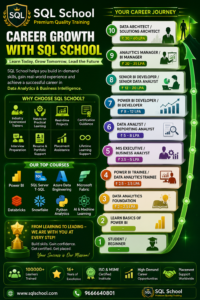
Why Choose SQL School for Power BI Training?
SQL School Training Institute is committed to helping students and professionals build successful careers in Data Analytics and Business Intelligence through practical, industry-focused training. Our Power BI course is designed to provide hands-on experience, real-world projects, and expert guidance that prepare you for today’s competitive job market.
Industry-Focused Curriculum
Learn the latest Power BI technologies, including Power Query, DAX, Data Modeling, Dashboard Design, Report Publishing, and Business Intelligence best practices aligned with current industry requirements.
Experienced Trainers
Get trained by experienced professionals with extensive real-time industry knowledge. Learn practical techniques, best practices, and real-world problem-solving approaches.
Hands-on Practical Learning
Every concept is taught with live demonstrations, hands-on exercises, assignments, and real-world business scenarios to ensure you gain practical experience.
Real-Time Projects
Work on industry-level Power BI projects involving sales analysis, finance, HR, healthcare, retail, and business performance dashboards to build a strong portfolio.
Interview Preparation
Receive comprehensive interview support, including mock interviews, resume building, portfolio guidance, and frequently asked Power BI interview questions.
Certification Guidance
Get expert guidance for Microsoft Power BI certifications and learn the concepts required to succeed in certification exams.
Flexible Learning Options
Choose from Online Live Classes, Classroom Training, Weekend Batches, or Fast-Track Programs according to your schedule.
Placement Assistance
Benefit from dedicated placement support, career mentoring, job referrals, interview scheduling, and career guidance to help you secure opportunities in leading organizations.
Lifetime Learning Support
Access recorded sessions, updated course materials, doubt clarification, and continuous learning support even after completing the course.
Conclusion
Power BI is one of the most powerful Business Intelligence tools used by organizations worldwide to transform data into meaningful insights. Mastering Power BI enables you to build interactive dashboards, automate reporting, analyze business performance, and make data-driven decisions with confidence.
At SQL School Training Institute, we combine expert instruction, practical learning, real-time projects, certification guidance, and placement assistance to help you become a confident Power BI professional. Whether you are a student, a working professional, or someone looking to switch careers, SQL School provides the right platform to develop in-demand skills and achieve long-term success in Data Analytics and Business Intelligence.
Start your Power BI journey with SQL School today and transform your data into powerful business insights while building a successful career in analytics.
#PowerBI #PowerBITutorial #PowerBIReports #PowerBIDashboard #PowerBIDesktop #PowerBITraining #PowerBIDeveloper #DataAnalytics #DataVisualization #BusinessIntelligence #DataAnalyst #DashboardDesign #ReportDesign #InteractiveReports #PowerQuery #DAX #KPI #MISReporting #BIDeveloper #AnalyticsEngineer #BusinessAnalyst #ReportingAnalyst #LearnPowerBI #MicrosoftPowerBI #PowerBICareer #SQLSchool #SQLSchoolTraining #DataCareer #BusinessAnalytics #CareerInAnalytics
Full course details:-https://sqlschool.com/powerbi-data-analyst-training/
Trainer: Mr. Sai Phanindra
With 20+ Years

Follow us daily for more updates!
WhatsApp Channel: https://whatsapp.com/channel/0029VamSJLI35fLmVEvCPD3r
WhatsApp Job Updates : https://whatsapp.com/channel/0029Vb2LI8zG3R3dWqv5jS1T
Instagram : https://www.instagram.com/sqlschool__training
YouTube : www.youtube.com/sequelschool
Trainer Profile : www.linkedin.com/in/saiphanindra
Website : www.sqlschool.com
Reach Us: +919951440801 | +919666440801
